The Woodsman
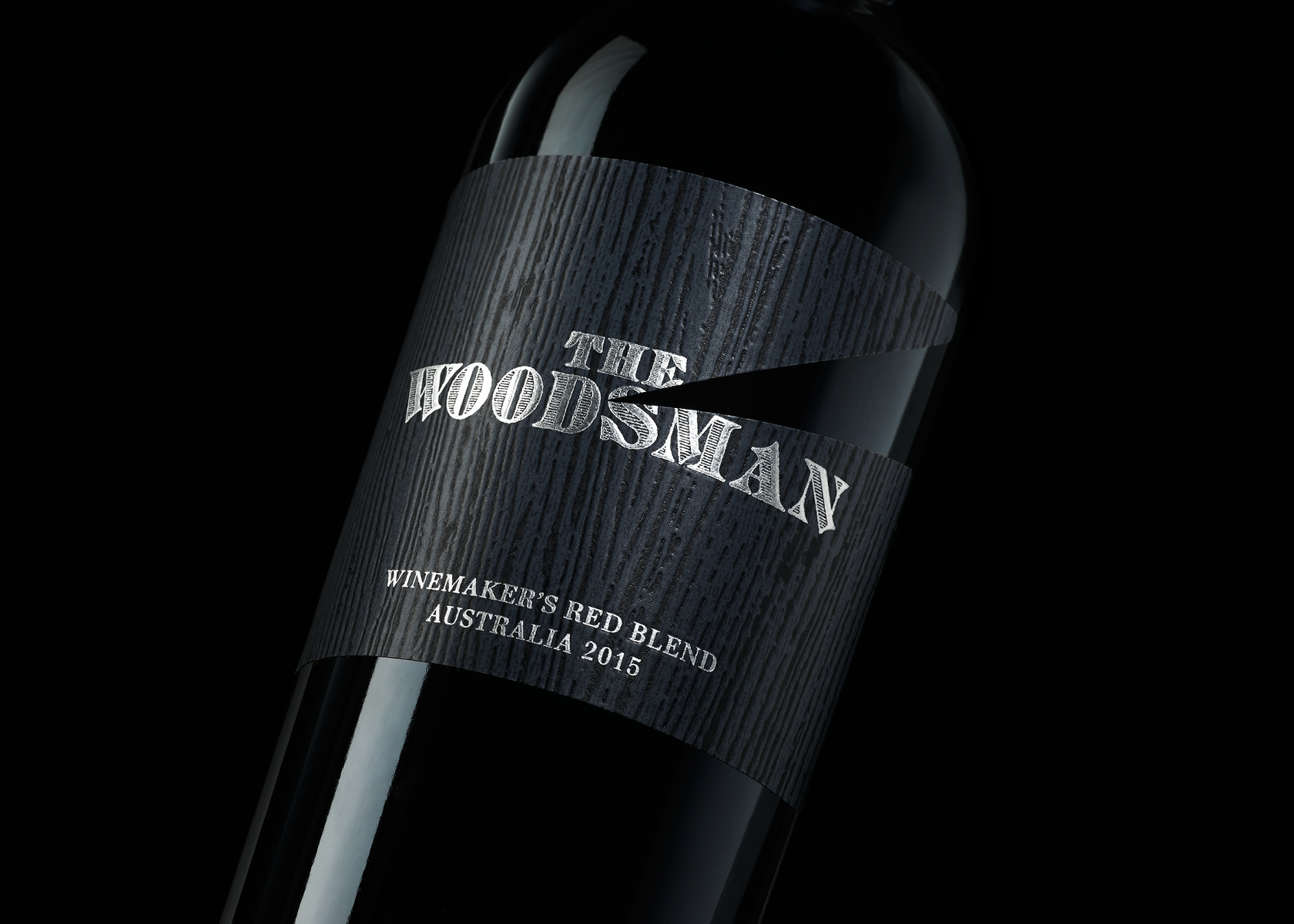
The Woodsman / A simple strike of an axe, and a cut in the label, creates a bold graphic label and an eye-catching detail that only hints at what The Woodsman's dark story could be.
Previous
Next

THE WOODSMAN
The brief was to develop a new name and brand for a red blend wine. Research for the category aimed it at a predominantly male consumer, and visual standard in the category that's led by gritty, gothic inspired themes. A simple strike of an axe created a bold graphic label and an eye-catching detail that hints at what The Woodsman's full story could be. The Woodsman tale is further enhanced by a wooden texture, raised with embossing to add a tactile quality to the package.


